Blog
Welcome

Recent posts
SEARCH RESULTS FOR: Design Service

To that old saying about the only certainties being death and taxes, we need to add CHANGE! Change never ends, and as long as you don’t mind a bit of a roller coaster, it’s way more fun! We have so much coming up over the next weeks and months, we thought we’d better give you a heads-up. If you like what we stand for, we think you’ll love what we’re doing. And what do we stand for? Beautiful photography, beautifully presented. But it’s your opinion that matters, so click through to comment on our blog or Facebook. We’d love to To View More >>

Everything we do is about adding value to your photography … to help sell your art, your craft, your intellectual property, your time! Matting a work of art is a powerful, longstanding way to add to its worth, and we offer matting in several products — like albums, frames and boxes. But we also offer “loose” matted prints, and new customers are sometimes surprised to find they’re just as beautifully presented. We supply them with an embossed cover sheet to protect the mat and print … and make the treasure inside more special. The embossed Q device To View More >>

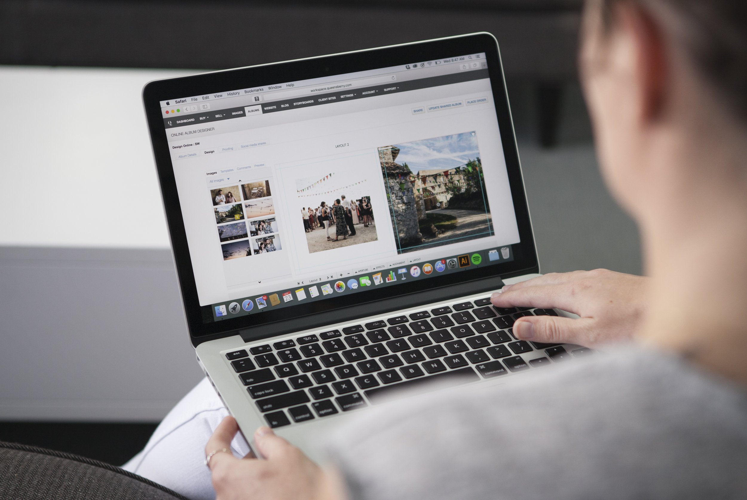
Following on from last week's post, here are a few more album design tips. For all you photographers designing your own. Let them breathe… We touched on cropping last time, but it's worth repeating! Sure photo-bombing is fun, but generally we like the core elements of an image to have a nice amount of breathing space to the edge of the page, or image "frame". In fact think of it exactly like framing a picture: it gives the subject a sense of intent and importance. Jamming things up against the image edge often looks awkward. To View More >>

We caught up with two of the design team, Simon and Rachel, to talk all things album design. Here are their top four tips for creating beautiful, clean layouts. Less is more Rachel: Unclutter your design. It’s simple. Let the key images and high quality materials of an album speak for themselves. If you notice the design, it’s taking precedence over the images – good design is effortless. Simon: If the design is loaded with images the hero shots can be lost among a forest of images. By keeping the image selection minimal, you’ll free up space and make To View More >>

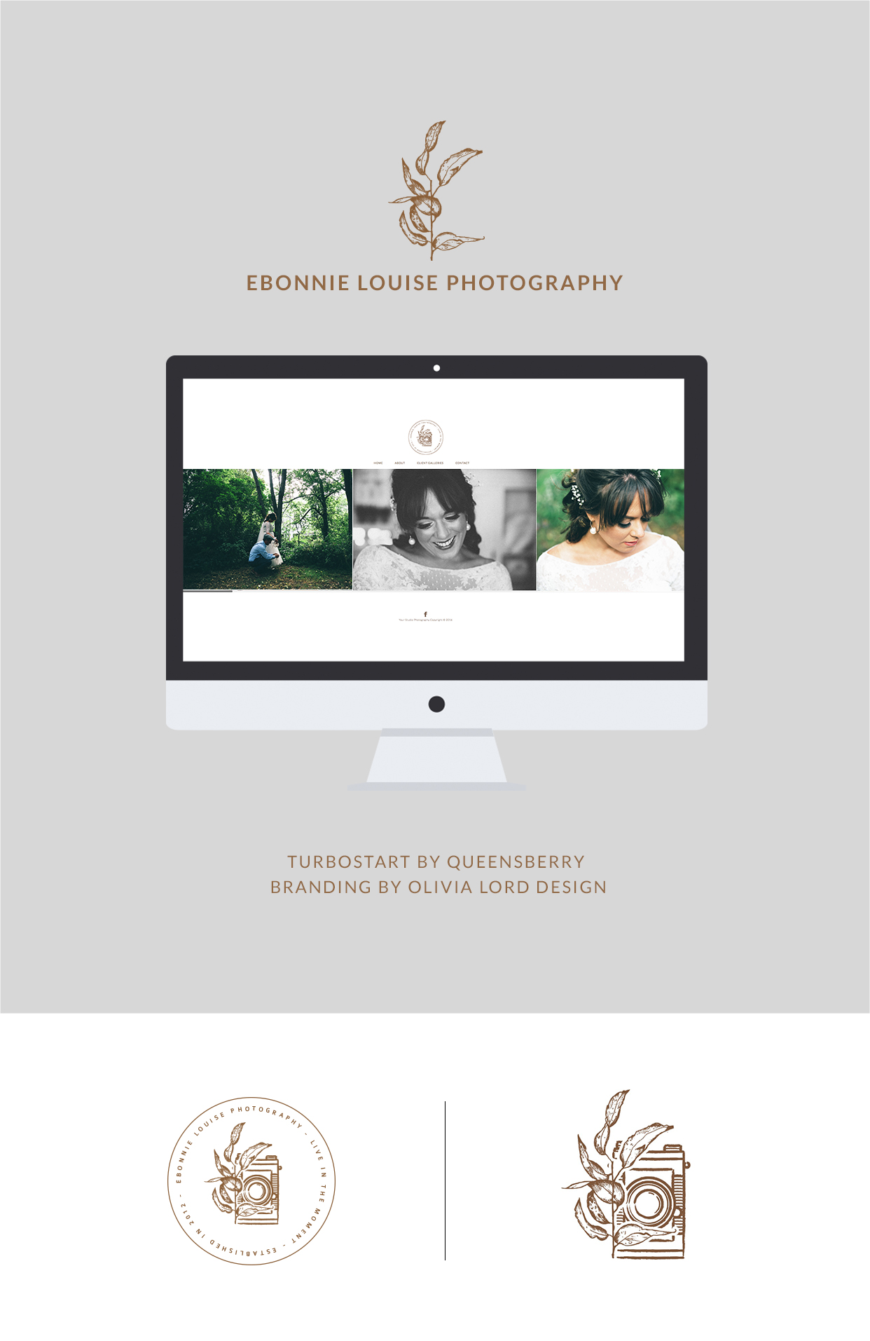
Recently we worked with Ebonnie Louise Photography to set up her website, and we had so much fun we thought we’d share it with you. We worked with her under our Turbostart service, which helps photographers with their Workspace websites. Ebonnie had worked with Olivia Lord Design to create her brand identity, so she came to us with a strong brand, and brand message, which was great, for two reasons. First, we knew exactly what she was after, which made her the ideal customer. And second, Turbostart is not about design and branding, but the technical To View More >>


Email: info@queensberry.com
Free Phone Numbers:
New Zealand: 0800 905 905
Australia: 1800 146 251
USA: +18668350851
UK: 0800 808 5271
Canada: +1 855 581 0370